
Nokia Changes Iconic Logo For 1st Time In 60 Years
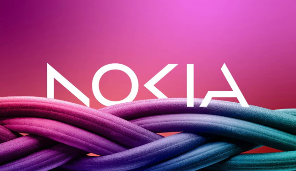
Barcelona: As the telecom equipment maker focuses on aggressive growth, Nokia announced plans on Sunday to change its brand identity for the first time in nearly 60 years, complete with a new logo.
The new logo comprises five different shapes forming the word NOKIA. The iconic blue colour of the old logo has been dropped for a range of colours depending on the use.
“There was the association to smartphones and nowadays we are a business technology company,” Chief Executive Pekka Lundmark told Reuters in an interview.
Major technology firms have been partnering with telecom gear makers such as Nokia to sell private 5G networks and gears for automated factories to customers, mostly in the manufacturing sector.
Nokia plans to review the growth path of its different businesses and consider alternatives, including divestment.
 Home
Home Videos
 Odisha
 Nation
 World
World Crime
Crime Politics
 Sports
 Health
 Lifestyle
 Business
 Education
 Entertainment
Comments are closed.